


This is a repost from the article I wrote for the Salesforce Developer Blog.
Have you ever wanted a progress bar in your linghtning app?
I have and so I came up with a simple bootstrap library wrap up.
Following the successful Lightning series, I'm going to show you how I've made a simple Lightning Component out of the awesome Bootstrap library Bootstrap Progressbar (see details in the project's home page).
For those who are in a TL;DR mode, here is the Github repository with the full code of the component and the demo app.
Let's start with the component signature:
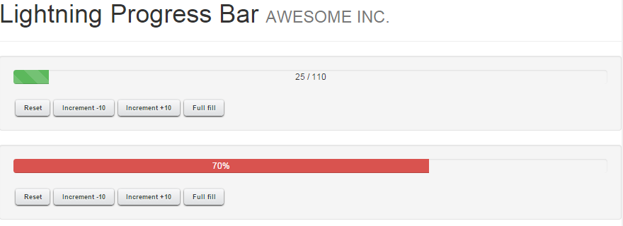
The component uses 2 kind of events:
The ProgressBarActionEvt has an action parameter that could have the following values:
Finally let's see how the component is constructed.
First we need to load jQuery and Bootstrap libraries and the required stylesheets:
handleEvent is the controller's function that handles an incoming action event:
The last command "redraws" the progress var with the new value, and executed the animation.
This is an example of fully javascript components you can make wrapping up existing javascript plugins.
Enjoy this component and may the Force.com be with you!
Have you ever wanted a progress bar in your linghtning app?
I have and so I came up with a simple bootstrap library wrap up.
Following the successful Lightning series, I'm going to show you how I've made a simple Lightning Component out of the awesome Bootstrap library Bootstrap Progressbar (see details in the project's home page).
For those who are in a TL;DR mode, here is the Github repository with the full code of the component and the demo app.
Let's start with the component signature:
<c:ProgressBarThese are the attributes we can set:
name="pb1"
valueMin="0"
valueMax="1000"
value="500"
displayText="center"
usePercentage="true"
barContainerClass="progress-striped active"
barClass="progress-bar-info"
transitionDelay="10"
displayText="center"/>
- name: name of the progress bar. This is used to ease events management
- valueMin: bar minimum value, defaulted to 0
- valueMax: bar maximum value, defaulted to 100
- value: starting progress bar value
- displayText: position of current value's text (center or fill), blank for no text
- usePercentage: shows the a % value text or value/max
- barContainerClass: class of the container of the progress bar: this gives a style (leave blank for no additional effect, "progress-striped" for a "stripped" decoration and "active" to get a move)
- barClass: this is to be applied to the bar, following the Bootstrap style (progress-bar-info, progress-bar-danger, progress-bar-warning, progress-bar-success, progress-bar-primary)
- transitionDelay: delay in ms for the animation
The component uses 2 kind of events:
- ProgressBarActionEvt: this is an event used to command the progress bar
- ProgressBarMessageEvt: this is an event that is used by the progress bar to alert that the MIN/MAX values has been reached
<aura:event type="APPLICATION" description="Inbound event to guide the progress bar" >ProgressBarMessageEvt
<aura:attribute name="value" type="Integer" default=""
description="Value of the event"/>
<aura:attribute name="name" required="true" type="String"
description="Progress bar name"/>
<aura:attribute name="action" required="true" type="String"
description="Progress bar action"/>
</aura:event>
<aura:event type="APPLICATION" description="Outboud event to guide the progress bar" >Both messages are really similar. Both have a name attribute to understand which progress bar should trap / fire the event, and a value attribute that has the value of the event.
<aura:attribute name="value" type="Integer" default=""
description="Value of the event"/>
<aura:attribute name="name" required="true" type="String"
description="Progress bar name"/>
<aura:attribute name="message" required="true" type="String"
description="Progress bar message"/>
</aura:event>
The ProgressBarActionEvt has an action parameter that could have the following values:
- Increment: increment by the value passed
- Decrement: decrement by the value passed
- FullFill: fullfills the progress bar
- Reset: resets progress bar's value
- SetValue: sets a specific value
//...And in its helper:
increment10_p1 : function(component, event, helper) {
helper.sendMessage("Increment","pb1",10);
},
//...
({
 sendMessage : function(message,name,value) {
  var incrementEvt = $A.get("e.c:ProgressBarActionEvt");
        incrementEvt.setParams({
            name: name,
            value: value,
            action: message
        });
        incrementEvt.fire();
 }
})
On the other side, when we want to handle a message from the progress bar to the container app, we attach a handler to the event:<aura:application>
<aura:handler event="c:ProgressBarMessageEvt"
action="{!c.handleProgressBarEvent}" />
<!-- ... -->
<div id="{!globalId+'_msg'}" />
//...So every time a ProgressBarMessageEvt event is fired, the apps catches it and write down some of its info into the given DIV HTML component.
handleProgressBarEvent : function(component, event, helper){
var originName = event.getParam("name");
var message = event.getParam("message");
document.getElementById(component.getGlobalId()+'_msg')
.innerHTML = message+" event for progress bar named '"+originName+"' at "+(new Date()).toLocaleString();
},
//...
Finally let's see how the component is constructed.
First we need to load jQuery and Bootstrap libraries and the required stylesheets:
<aura:component >And then define the place where the Bootstrap Progressbar will be drawn:
<ltng:require scripts="/resource/BootstrapSF1/js/jquery-2.1.1.min.js,
/resource/BootstrapSF1/bootstrap320/js/bootstrap.min.js,
/resource/BootstrapProgressbar/bootstrap-progressbar.min.js"
styles="/resource/BootstrapSF1/bootstrap320/css/bootstrap.min.css,
/resource/BootstrapProgressbar/bootstrap-progressbar.min.css"
afterScriptsLoaded="{!c.onInit}"/>
<aura:handler event="c:ProgressBarActionEvt" action="{!c.handleEvent}" />
<aura:registerEvent name="progressBarMsgEvt" type="c:ProgressBarMessageEvt"/>
<!-- ... -->
<!-- ... -->This component will be fully configured by the "onInit" function of the component's controller (that is called once all JS/CSS files are loaded):
<div class="{!'progress '+v.barContainerClass}">
<div id="{!globalId+'_progbar'}" class="{!'progress-bar '+v.barClass}"
role="progressbar"
data-transitiongoal="{!v.value}"
aria-valuemin="{!v.valueMin}"
aria-valuemax="{!v.valueMax}"></div>
</div>
<!-- ... -->
//...The done handler of the progress bar is used to fire the ProgressBarMessageEvt when the bar reaches min o max values.
onInit : function(component, event, helper) {
$("[id='"+component.getGlobalId()+"_progbar']")
.progressbar({
display_text: 'center',
transition_delay: component.get('v.transitionDelay'),
refresh_speed: component.get('v.refreshSpeed'),
display_text: component.get('v.displayText'),
use_percentage: component.get('v.usePercentage'),
done : function(cmp){
$A.run(function(){
if(component.get("v.value") >= component.get("v.valueMax")){
var evt = $A.get("e.c:ProgressBarMessageEvt");
evt.setParams({
name: component.get("v.name"),
message: "MaximumReached",
value: component.get("v.value")
});
evt.fire();
}
if(component.get("v.value") <= component.get("v.valueMin")){
var evt = $A.get("e.c:ProgressBarMessageEvt");
evt.setParams({
name: component.get("v.name"),
message: "MinimumReached",
value: component.get("v.value")
});
evt.fire();
}
});
}
});
},
//...
handleEvent is the controller's function that handles an incoming action event:
//...It simply checks progress bar name's, action, value and executes the corresponding action.
handleEvent : function(component, event, helper){
var targetName = event.getParam("name");
if(targetName !== component.get("v.name")) return;
var targetIncrement = event.getParam("value");
var action = event.getParam("action");
var value = component.get("v.value");
if(action === 'Decrement') value -= targetIncrement;
else if(action === 'Increment') value += targetIncrement;
else if(action === 'FullFill') value = component.get("v.valueMax");
else if(action === 'Reset') value = component.get("v.valueMin");
else if(action === 'SetValue') value = targetIncrement;
var pb = $("[id='"+component.getGlobalId()+"_progbar']");
if(value = component.get("v.valueMax")){
value = component.get("v.valueMax");
}
component.set("v.value",value);
pb.attr("data-transitiongoal",value).progressbar();
},
//...
The last command "redraws" the progress var with the new value, and executed the animation.
This is an example of fully javascript components you can make wrapping up existing javascript plugins.
Enjoy this component and may the Force.com be with you!
Commenti
Posta un commento